🍰🍇🍨🥝
HelloFresh Extras
Background
HelloFresh wanted to launch a new category called Extras that included products such as desserts and fruit. This was an effort towards diversifying the product range, and offer food for occasions other than dinner—the company’s main offering. Extras are available as one-off purchases and on a subscription basis. The challenge for the product team that I worked with was to build and integrate an MVP within the current digital experience across iOS, Android, and the web as well as continually optimised the experience to suit the user needs while driving the product uptake.
Solution and success
We built an MVP for one of the small regional markets to gauge the customer response to the product. As we optimised the experience and built more confidence in the product, we rolled it out in a number of countries and nearly doubled the uptake within two quarters.
My role
I was involved in the project from concept formation to the execution phase. This included-
- competition benchmarking
- concept creations
- UI design and rearchitecting user journeys
- validating concepts with usability testing (working with a UX researcher)
- measure performance and iteratively optimise designs
- stakeholder management
__
Process
Phase I: Launch Extras without disrupting the existing meal selection experience
Problem to solve: Design an MVP to introduce and integrate a new line of product into the main ‘meal selection’ flow, with a primary goal of gauging customer interest in the new products. However, without much affecting the main flow or harming the uptake rate.
Solution: Identify the moments in the user journey to introduce the new products. Leverage these moments to generate awareness and nudge users to get the products. Additionally, offer a time-sensitive subscription opt-in to those who showed high engagement with the product. Remodelled the information architecture and extended the current flow to accommodate the new changes. Moreover, one of our main challenges was to ensure users understood that the new products, despite being part of the main menu, were ‘add-ons’, and not included in the main subscription.
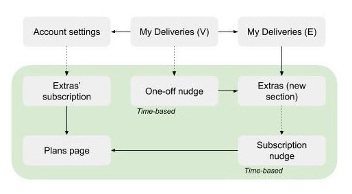
As a result of the revised information architecture...
• Additional tab for Extras was created (the behaviour on web differed from native apps)
• User flow and additional plans page for subscription model were generated
• Account settings page was redesigned to reflect the Extras subscription
• To added value at appropriate moments in the journey, time-based nudges were created to guide users to the new product
• User flow and additional plans page for subscription model were generated
• Account settings page was redesigned to reflect the Extras subscription
• To added value at appropriate moments in the journey, time-based nudges were created to guide users to the new product


Phase II: Analyse the user behaviour as well as product performance, and refine the product to better meet users’ expectations and needs
As the product gained enough traction to meet the success criteria set for the MVP, we focused on driving the performance. Working with the data analytics team we found out that a significant amount of drop-offs were occurring at a particular moment in the flow.
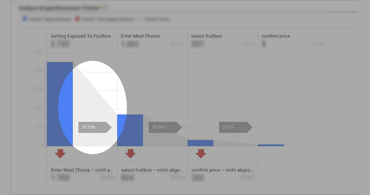
Looking at the meal selection funnel, we discovered only 38% customers were getting exposed to Extras.
Usability testing
To understand the problem further we did a usability test with existing customers. The test was comprised of 6 goal-based tasks. The participants were existing customers of varying loyalty score. Findability, clarity in the communication, and understanding of the modular subscription model were the key areas we investigated through the tests. I worked closely with the resident UX researcher to formulate the test plan.
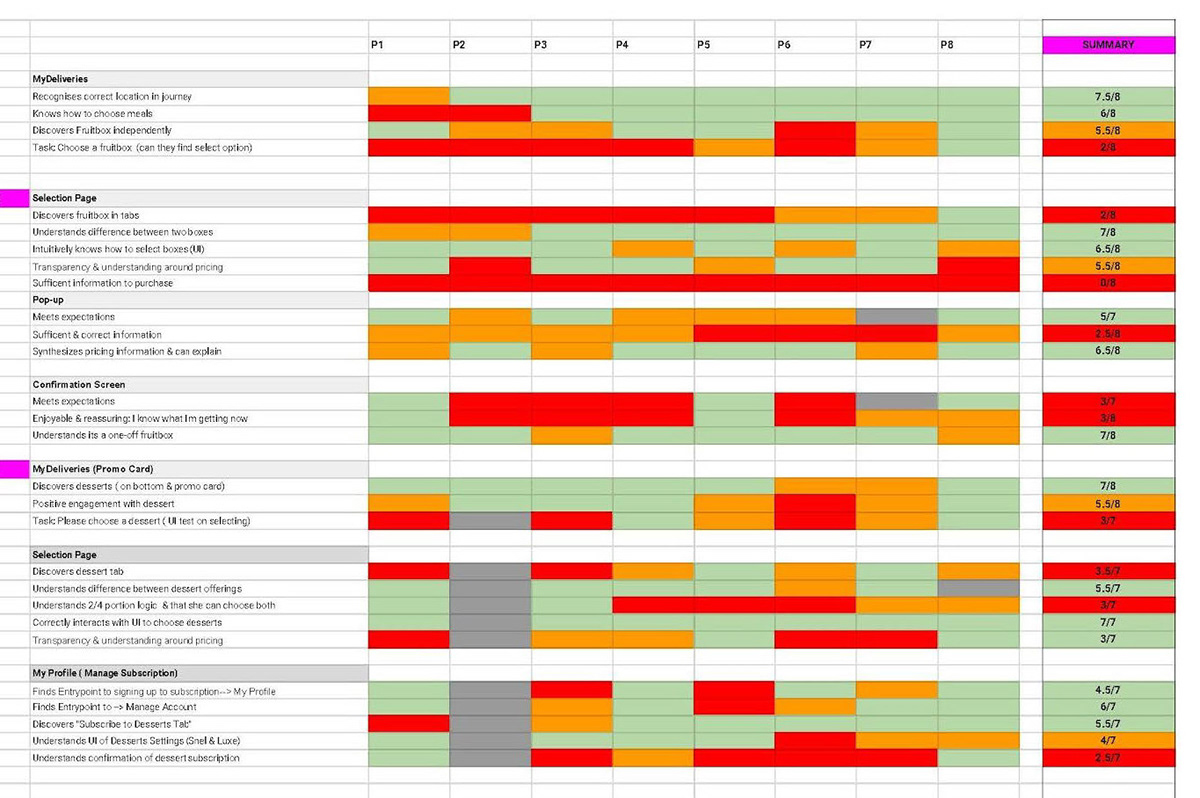
Usability test results summary sheet
Findings and design revisions
Finding 1: Extras would usually go undetected by users on the Meal Choice page
This was partly due to unclear terminology used for the new products ( the key terms used for the main flow were not to be altered). This hindered from highlighting Extras.
Solution: We redesigned the funnel, where we split the meal and Extras into two parts. This helped Extras gain more prominence without touching the meal selection experience.
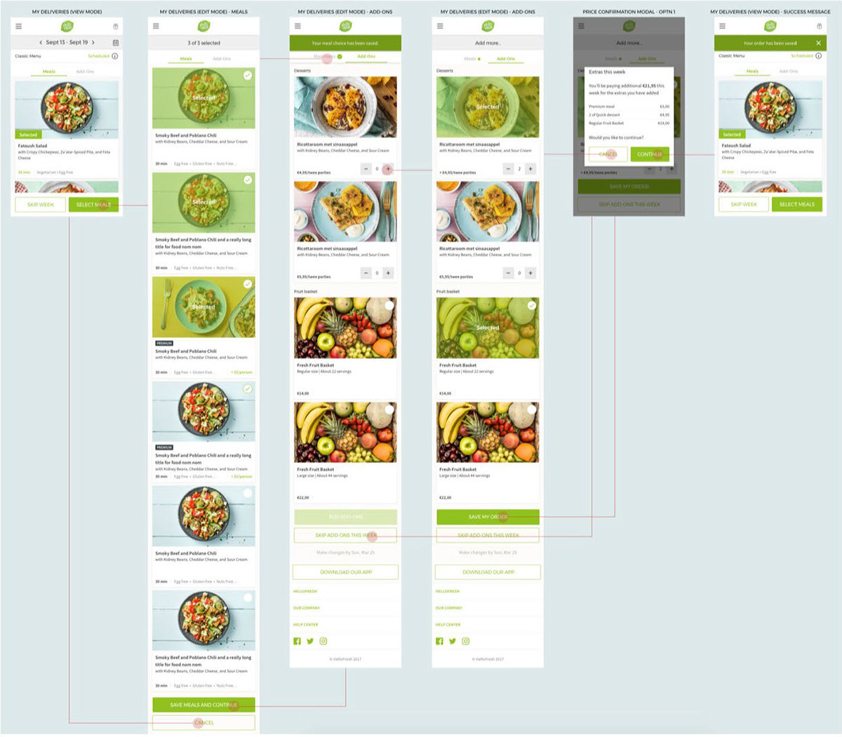
Redesigned funnel that routed users through newly created Extras page
Finding 2: Extras had very low visibility on My Deliveries page which led to considerably low engagemnt
Since the products were ‘added’ to the existing layout of the page, they sat far too down on the scroll, and we discovered users don’t scroll much on this page. Another problem was that the Extras couldn’t be added unless users entered the Meal Choice mode.
Solution: Each week one product from Extras was featured higher up on the screen with the ability to add from other pages as well.
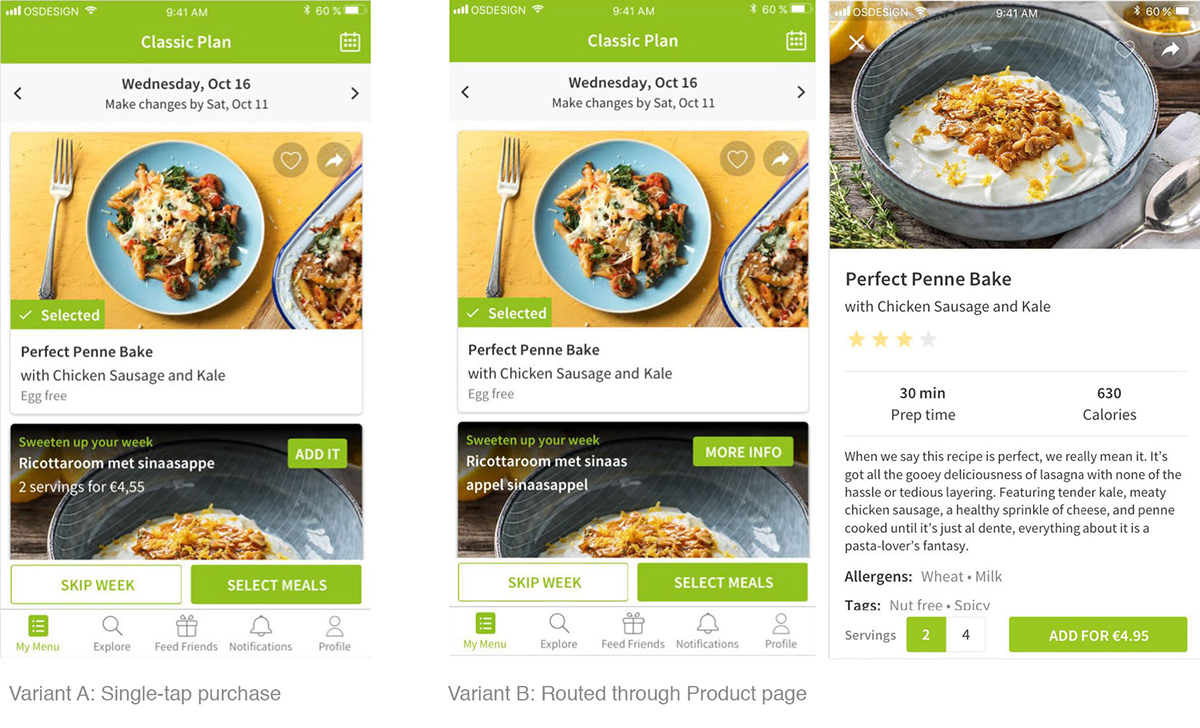
Finding 3: Insufficient or unclear information
Wsers were confused about information such as delivery date, size and quantity of products
Solution: We introduced new text to provide more clarity at relevant moments in the user journey. We also made the CTA text more descriptive to better inform users what action they are about to perform and what to expect as a result of that.


Revised buttons to clarify that the Extra will be only added to a particular week, and not as a recurring subscription
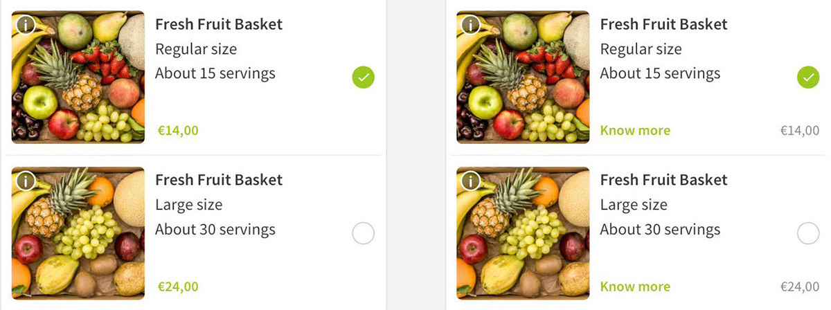
The info button the image was easily missed by most test participants, hence we added a clear action text, "Know more" to take users to the product description page.
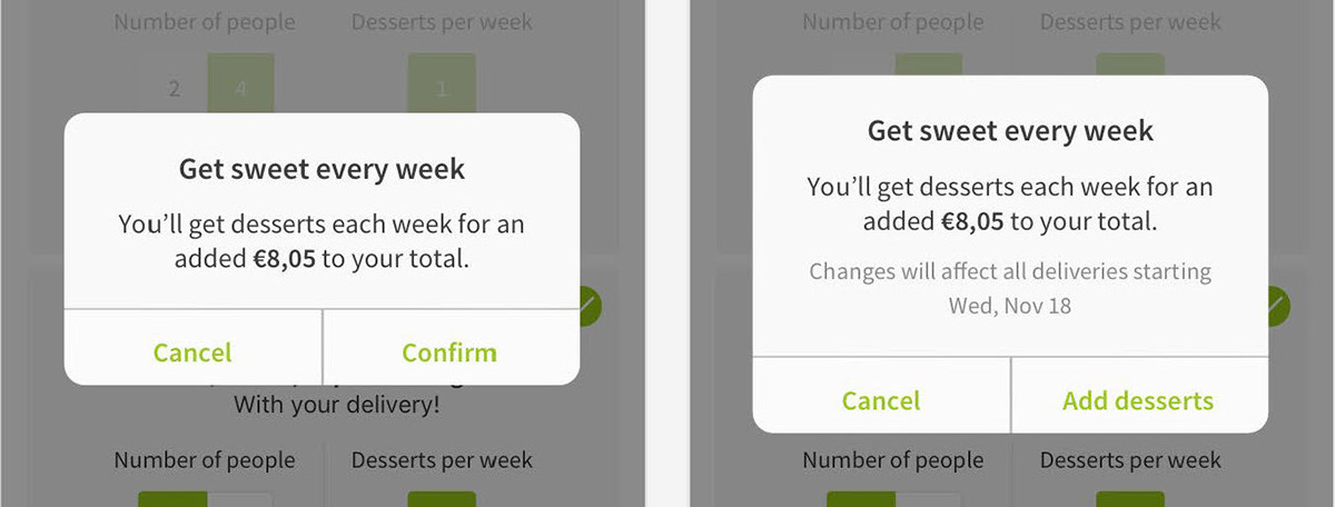
Another insight from the study was that users didn't know when to expect changes to affect their deliveries. To clear this confusion, on the confirmation modal, we added clear indication of from which exact delivery the changes to the deliveries will be made.
As a result of these design revisions, the uptake of Extras went up by 193% in two quarters.
